데이터 분석1-2: 데이터 시각화 실습
데이터 분석1-2: 데이터 시각화 실습
일단 라이브러리와 데이터를 불러와야 된다. 이 실습에서 데이콘의 제주도 도로 교통량 예측 데이터를 사용한다.
1
2
3
4
5
6
7
8
9
10
import pandas as pd
import matplotlib.pyplot as plt
import seaborn as sns
import numpy as np

sns.set(color_codes=True)
%matplotlib inline

df = pd.read_csv('sampled_train.csv')
df.head()
10-1 데이터 탐색과 시각화
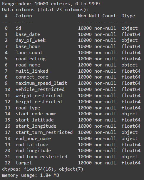
결측치 있는지, 데이터 크기 등 확인
1
df.info()
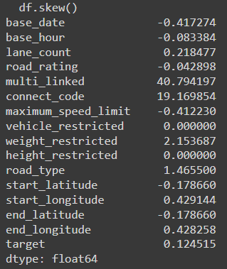
왜도 확인하기
1
df.skew()
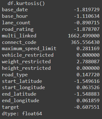
첨도 확인하기
1
df.kurtosis()
10-2 공분산과 상관성 분석
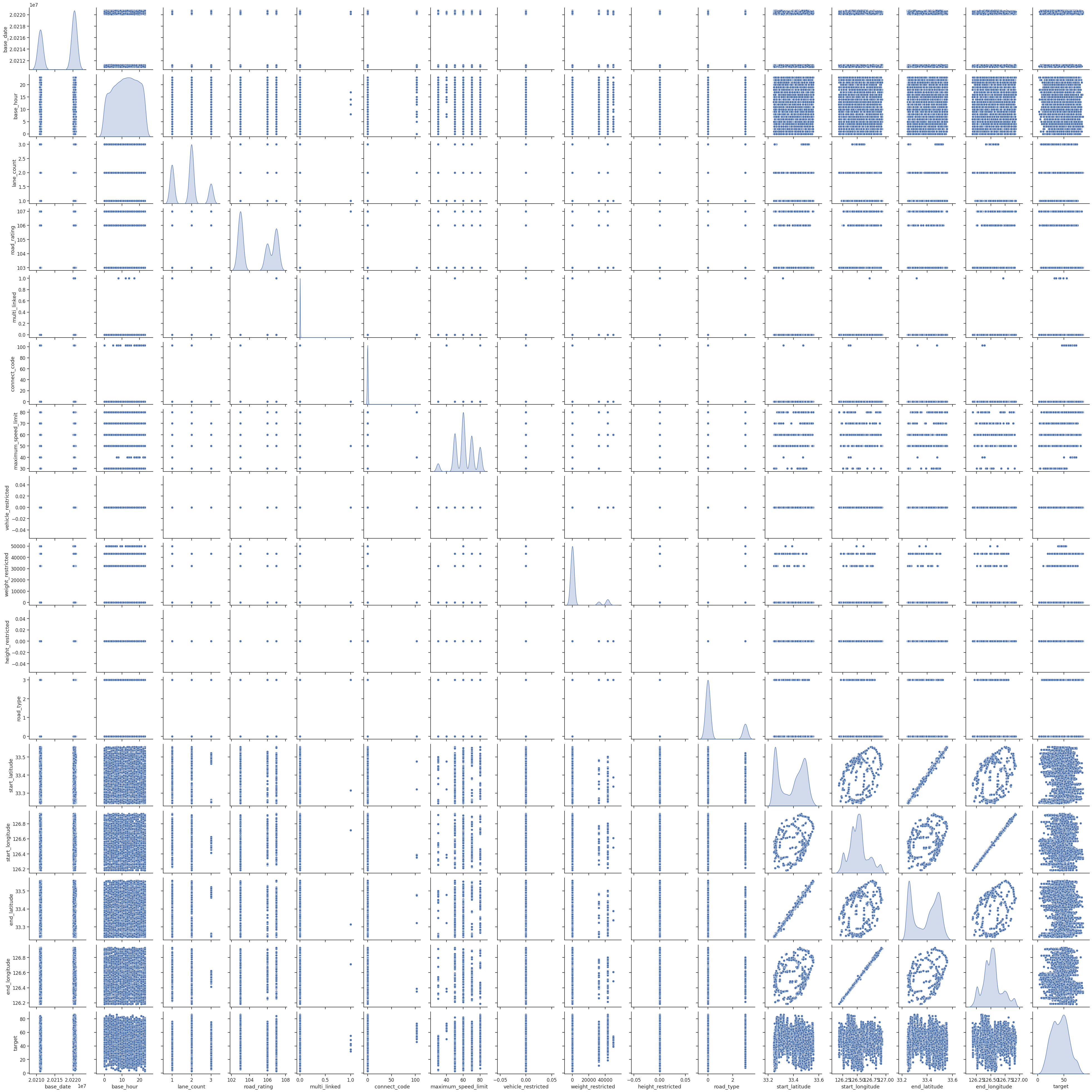
상관성을 표현하는 산점도를 그려보기
1
2
3
4
sns.set(font_scale=1.1)
sns.set_style('ticks')
sns.pairplot(df, diag_kind='kde')
plt.show()
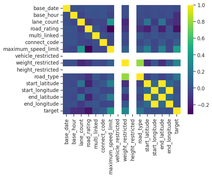
상관성을 표현하는 히트맵을 그린다.
1
sns.heatmap(df.corr(), cmap='viridis')
10-3 시간 시각화
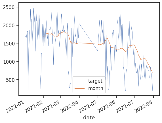
선그래프를 그려보기
1
2
3
4
5
6
7
8
9
10
11
12
13
14
import datetime

df['date'] = pd.to_datetime(df['base_date'], format='%Y%m%d')
df = df.sort_values(by='date')
df['year'] = df['date'].dt.year

df_line = df[df.year == 2022]

df_line = df_line.groupby('date')['target'].sum().reset_index()

df_line['month'] = df_line['target'].rolling(window=30).mean()

ax = df_line.plot(x='date', y='target', linewidth='0.5')
df_line.plot(x='date', y='month', linewidth='1', ax=ax)
10-4 비교 시각화
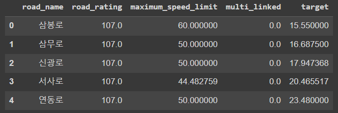
도로를 비교하기를 위하여 road_name과 target 포함 특성 몇개를 선택하여 새로운 데이터프레임을 만든다.
1
2
3
df1 = df[['road_name', 'road_rating', 'maximum_speed_limit', 'multi_linked', 'target']]
df1 = df1.groupby('road_name').mean().sort_values('target', ascending=True).reset_index()
df1.head()
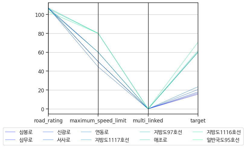
도로 기준의 평행 좌표 그래프를 그려보기
1
2
3
4
5
6
7
8
9
10
df2 = pd.concat([df1[:5], df1[55:60]]) # 타깃에서 평균속도 제일 빠른 도로 5개, 제일 느린 도로 5개 선택한다.
df2 = df2.reset_index().drop(['index'], axis=1)

from pandas.plotting import parallel_coordinates

fig, axes = plt.subplots()
plt.figure(figsize=(32, 16))
plt.rc('font', family='NanumBarunGothic')
parallel_coordinates(df2, 'road_name', ax=axes, colormap='winter', linewidth='0.5')
axes.legend(loc='upper center', bbox_to_anchor=(0.5, -0.1), ncols=5)
10-5 분포 시각화
와플 차트를 그려보기
1
2
3
4
5
6
7
8
9
10
11
12
13
14
15
16
17
from pywaffle import Waffle

fig = plt.figure(
    FigureClass=Waffle,
    plots={
        111: {
            'values': df2['target'],
            'labels': ["{0} ({1})".format(n, v) for n, v in df2['road_name'].items()],
            'legend': {'loc': 'upper left', 'bbox_to_anchor': (1.05, 1), 'fontsize': 8},
            'title': {'label': 'Waffle Chart', 'loc': 'left'}
        }
    },
    rows=10,
    figsize=(20,20)
)

plt.tight_layout()

10-6 관계 시각화
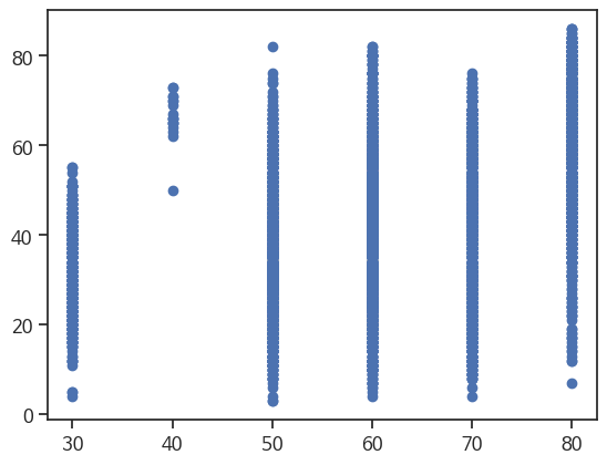
이산적인 데이터라서 선형 관계 볼 수 없어도 관계를 표현하는 산점도 그래프를 그려본다.
1
2
plt.scatter(df['maximum_speed_limit'], df['target'])
plt.show()
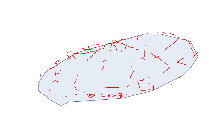
10-7 공간 시각화
데이터에 있는 start_latitude, start_longitude, end_latitude, end_longitude를 이용하여 컨넥션맵 그려본다
1
2
3
4
5
6
7
8
9
10
11
12
13
14
15
16
17
18
19
20
21
22
23
24
25
26
27
28
29
30
31
32
33
34
35
import folium
from folium import Marker, plugins, GeoJson
import plotly.express as px
import plotly.graph_objects as go

m = folium.Map(location=[33.38, 126.55], zoom_start=10)
source_to_dest = list(zip(df.start_latitude, df.end_latitude, df.start_longitude, df.end_longitude))
fig = go.Figure()

for a, b, c, d in source_to_dest:
  fig.add_trace(go.Scattergeo(
      lat = [a, b],
      lon = [c, d],
      mode = 'lines',
      line = dict(width=1, color='red'),
      opacity = 0.5
  ))

fig.update_layout(
    margin={'t':0, 'b':0, 'l':0, 'r':0, 'pad':0},
    showlegend=False,
    geo = dict(
        showcoastlines=True,
        center=dict(
            lat=33.38,
            lon=126.55
            ),
        projection=dict(
        scale=200
            ),
        resolution=50
    )
)

fig.show()
10-8 박스플롯
target 변수를 이용하여 간단한 박스플롯 그래프를 그려본다.
1
2
3
plt.figure(figsize=(5,5))
sns.boxplot(y='target', data=df)
plt.show()

Google Colab으로 실습하였으니 원본 파일을 첨부합니다.
This post is licensed under CC BY 4.0 by the author.